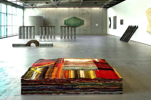
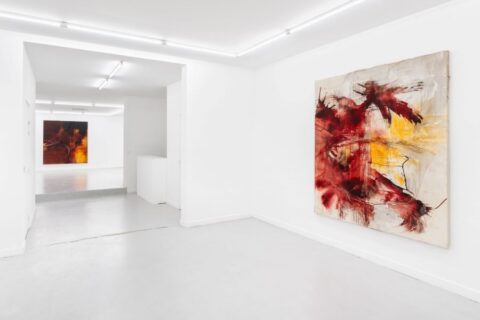
One of the world’s leading design museums, Vitra Design Museum (initially a Chair Museum) was founded in 1989 by the Vitra furniture company. The museum is situated in Weil-am-Rhein, next to the German/Switzerland border not too far from Basel.
At one point of my life, the museum was only a two hour drive away from where I lived. Meaning that every time the museum had a new temporary exhibition (typically twice a year), I took my car and hurled down to see and experience it.
At that time the upper floor of the museum was devoted to a dozen or so most famous chair designs, so as a bonus I could feel ”at home” by admiring a couple of Alvar Aalto’s acclaimed Paimio chairs amongst the other master pieces. (A chair can be a master piece for reasons other than its visual design. Aalto chairs were both functional and aesthetically rewarding plus they utilized some revolutionary methods to fold plywood.)
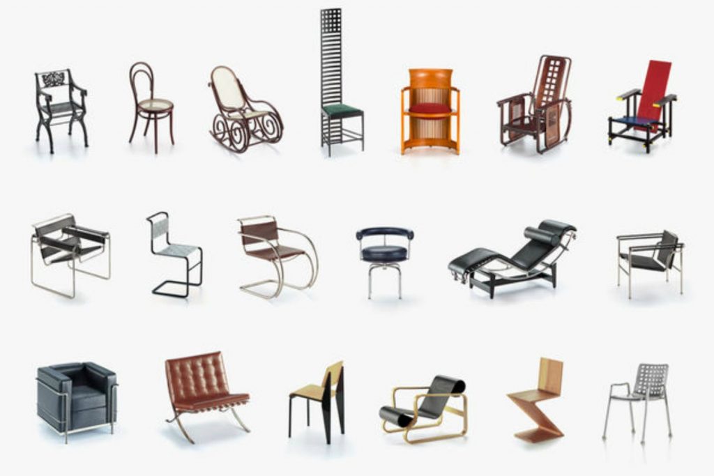
Back in the 1990s the Vitra Museum housed some internationally acclaimed exhibitions featuring eg. Charles and Ray Eames, Frank Lloyd Wright and Luis Barragán.
The main furniture collection, originally consisting of Vitra CEO Rolf Fehlbaum’s approximately 200 modern and contemporary chairs, has grown to over 6,000 objects including chairs, cutlery, consumer electronics, architectural prototypes, and other pieces of everyday furniture. Respectively, the task of the museum is no more just exhibiting chairs and other design objects, but to “examine and revaluate design’s relationship to architecture, art and everyday culture”.
Architecture
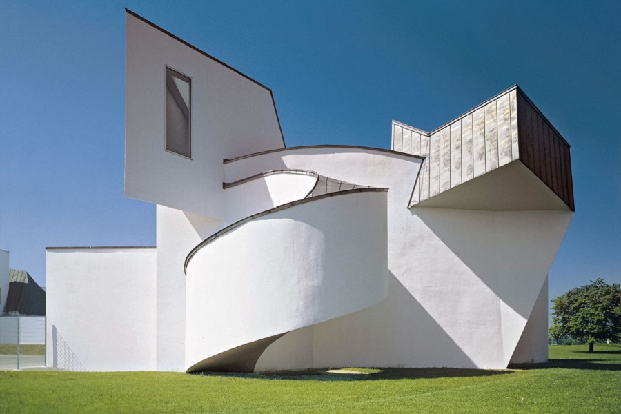
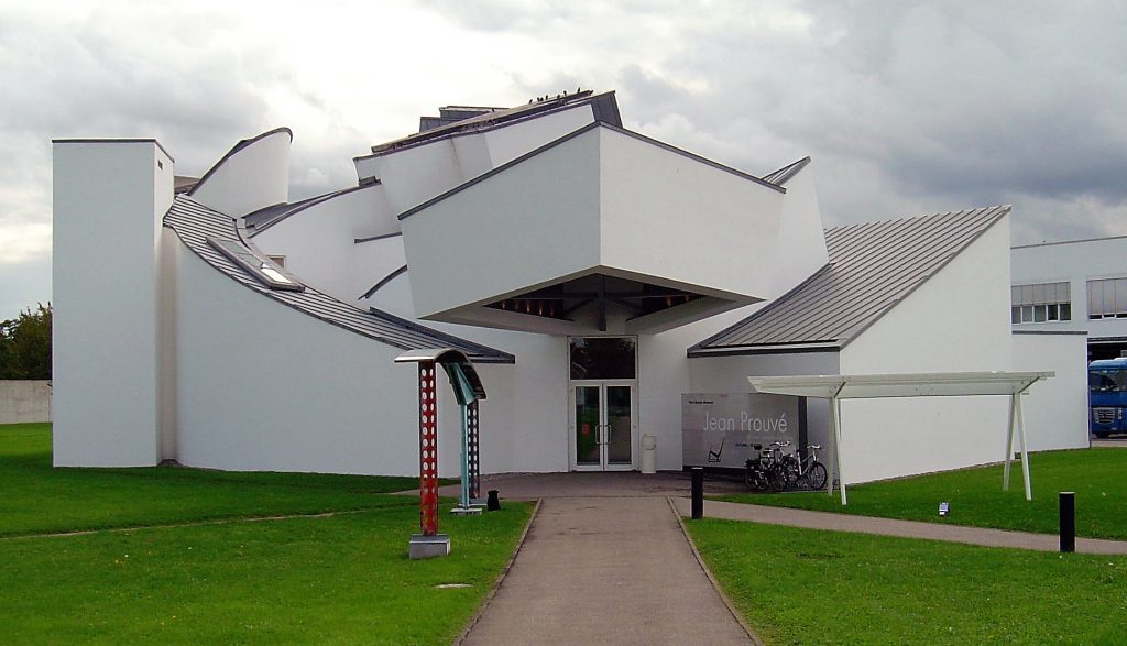
My trips to Weil-am-Rhein were also motivated by the chance to see the white serene museum building which is on par with the fabulous collections inside. The Vitra Design Museum was drawn by the Canadian/American architect Frank Gehry better know from Los Angeles (Walt Disney Concert Hall) and Bilbao (Guggenheim Museum) projects. With its sculptural forms and interconnecting curving volumes, “each seemingly going freely to their own direction without an apparent relationship to the other”, the museum is unmistakably a work of Frank Gehry.
Not only was the Vitra Design Museum Gehry’s first work in Europe, but it was also the very first structure to which Gehry applied his now signature sculptural style. In his early work Gehry employed straight lines and angles unlike in the style he later adopted. The new style began to emerge with the Vitra Design Museum. By common consent, the Vitra Design Museum signifies a clear transition between Gehry’s smaller-scale deconstructivist projects and the grander, sleeker aesthetic for which he is today recognized for.
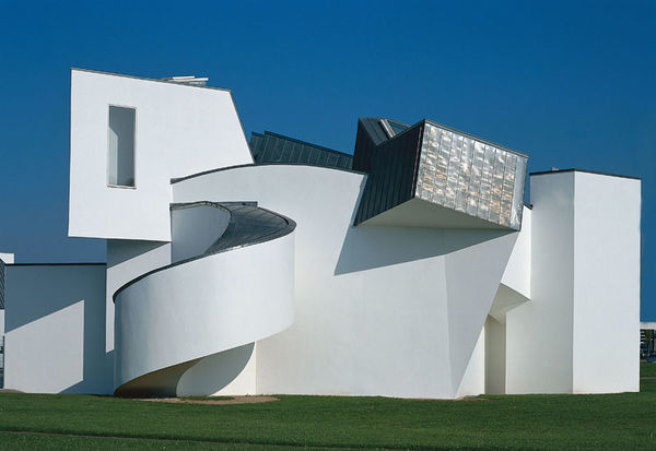
To me the Vitra Museum has always represented a highly successful mixture of angular and curved forms both in and outside. It looks fabulous from whatever angle one watches it, and the building is quickly walked around. Despite its wild shapes it retains geometricity and order, its modernism, perhaps even better than Gehry’s later more monumental works. It is precisely the angular straight lines cutting short the rounder ones that makes this abstract design so unique and charming.
With only 700 square meters, the Vitra Design Museum is a compact space (perhaps because it was originally meant for an exhibition space for some private collections only), and as such more clearly related to human scale than Los Angeles or Bilbao. The Museum stands in a flat front garden making it hard to speak of the building’s integrity with its surroundings, but conversely thinking, the randomness and improbability of the scene makes a big impact to the viewer.
Not only is it a compact building, it’s also characteristically white. All sloping curves and forms are finished in white plaster. As far as I know the Museum is Gehry’s only pure white structure – a fact that pleases the Scandinavian eye.
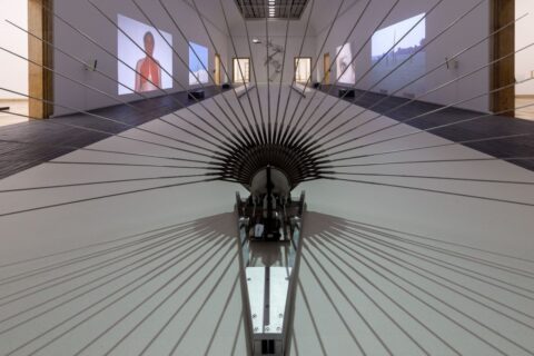
The Museum is kind of Scandinavian from inside too with the wooden surfaces, volumetric towers, bridges, and cubes displaying and reflecting the outer form of the building. And perhaps best of all, the way in which the natural light is passed through the internal white spaces is as beautiful as it is calming.
Its more geometric, less massive, more human sized, beautifully lit, and entirely white appearance caresses the Northern taste and makes the Vitra Design Museum still as one of Gehry’s best works.
Anyway it haven’t ceased to amaze me after 25 years.


